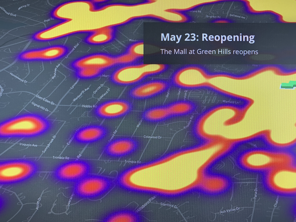
COVID and Movement
We wanted to show movement patterns on a map. With the movement data readily available, could we help viewers understand the effect of COVID on movement? By presenting this data overlaid on a map, we could let users see how movement changed over the course of 2020 as COVID forced people to stay home.
Using a scrolly-telling story
The scrolly-telling method allows you to present a story in sections. These sections would have a few words of text, and a corresponding map view to carry the message to the viewer. You’ve likely seen these types of webpages in the New York Times and National Geographic. There’s some really helpful source code that you can use to create your own. That’s what I used to build this one.
COVID affecting Movement
You can review the movement story here.
Play with Movement Data here
Make your own with the Storytelling Source Code